Most data sits quietly in the background, but the right chart or map can make it pop. Numbers suddenly become playful, odd, or even a little puzzling. A quirky comparison here, a strange trend there and suddenly you’re seeing information in a whole new way.
What makes them so engaging is how easily they catch your eye. No deep analysis needed; just a glance can reveal something surprising or amusing.
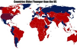
These 19 charts and maps packed with intriguing data turn everyday facts into witty, offbeat visuals that keep you scrolling with ease. 3/27/2026


Take a look at more quirky charts and maps.


Add comment