Numbers don’t usually get credit for being entertaining, but put them inside the right charts and maps and suddenly they steal the spotlight. This gallery proves that data doesn’t have to feel dry or predictable. Patterns appear where you least expect them, comparisons get oddly funny, and simple stats start telling stories you didn’t see coming.
Instead of long explanations, these visuals let the information speak for itself, sometimes clearly, sometimes in a way that makes you pause and look twice. Either way, it’s hard not to get hooked.
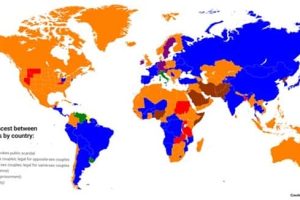
These 20 charts and maps with intriguing data turn everyday info into clever, quirky highlights that’ll keep you scrolling without even noticing. 2/27/2026


Take a look at more quirky charts and maps.


Add comment