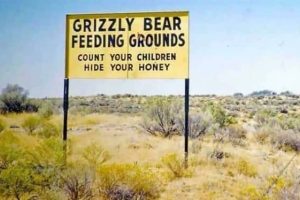
Funny results of bad kerning, letter spacing fails, and hilarious typography mistakes prove that even tiny errors can create big laughs.
If you’ve ever squinted at a sign and thought, “Wait, what?”, you’ve probably been a victim of bad kerning. Funny results happen when letter spacing goes completely off the rails, turning innocent messages into comedy gold. Typography isn’t just about picking a cool font, it’s about making sure your letters actually make sense together.
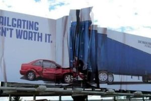
Bad kerning fails sneak up on you when you least expect it. One second you’re reading a normal sentence, the next you’re doing a double-take and laughing way too hard. It’s wild how just a little extra gap (or not enough) between letters can change the whole meaning. And once you see it, you can’t unsee it.
Typography fails remind us that a tiny design choice can create chaos or at least a lot of giggles. Whether it’s a poorly spaced billboard or a clumsy store sign, these letter spacing fails are pure entertainment. Honestly, we owe a big thank you to all the kerning disasters out there for keeping our days interesting.


Add comment