

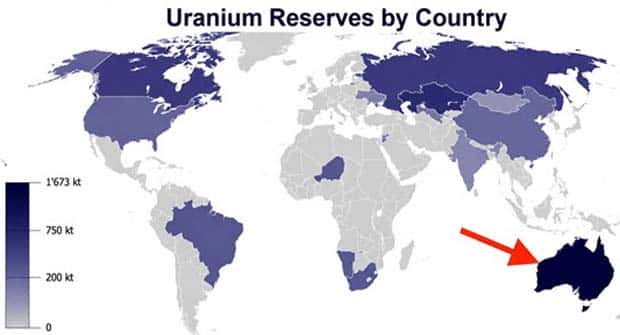
Forget long explanations and endless paragraphs. Sometimes a handful of numbers is enough to spark a question. This is especially true when those numbers appear in an unexpected way. A colorful map, a bizarre ranking, or a ridiculous comparison can make you stop scrolling just to figure out what you’re looking at.
That’s where the fun begins. These visuals mix useful information with plenty of little surprises, giving you something interesting to notice in almost every frame.
These charts and maps with intriguing data serve up unusual facts, unexpected comparisons, and plenty of reasons to keep scrolling. 8/7/2026
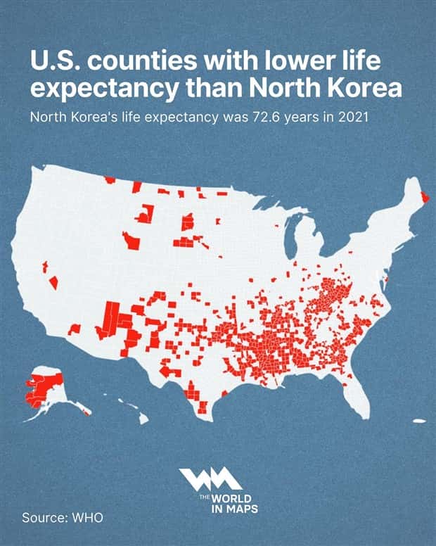
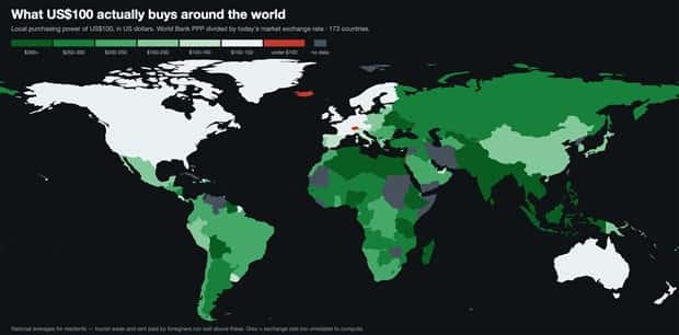
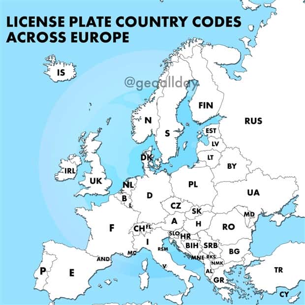
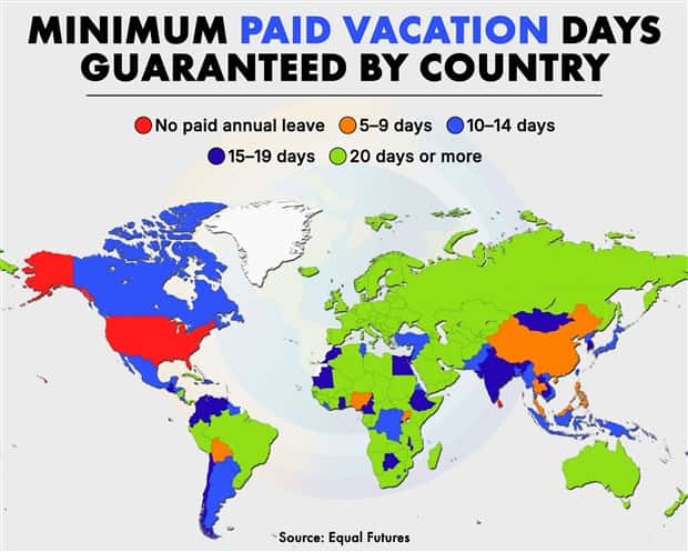

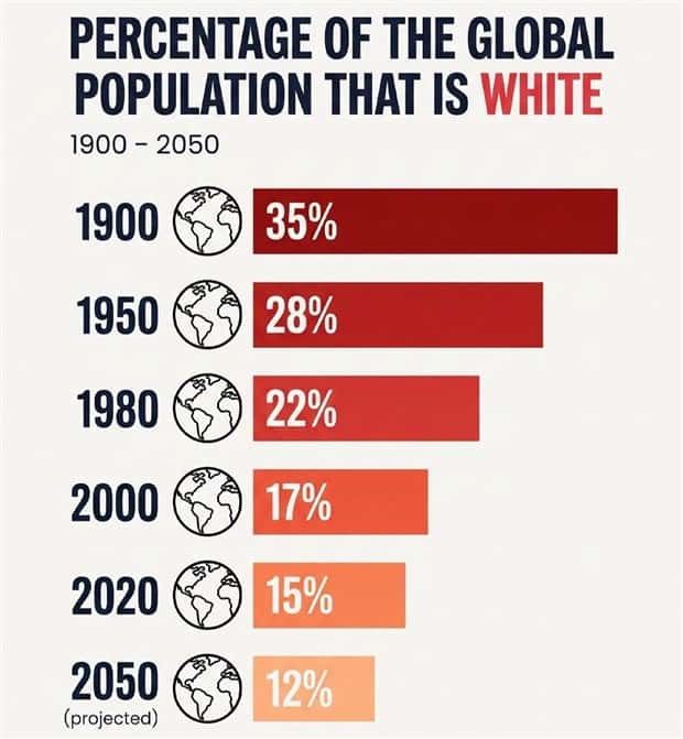
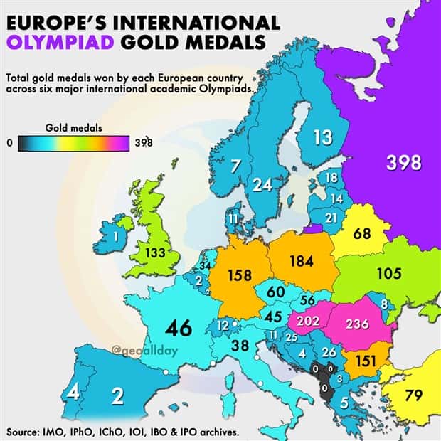
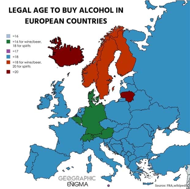
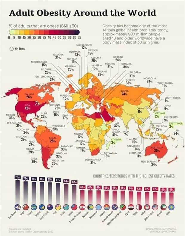
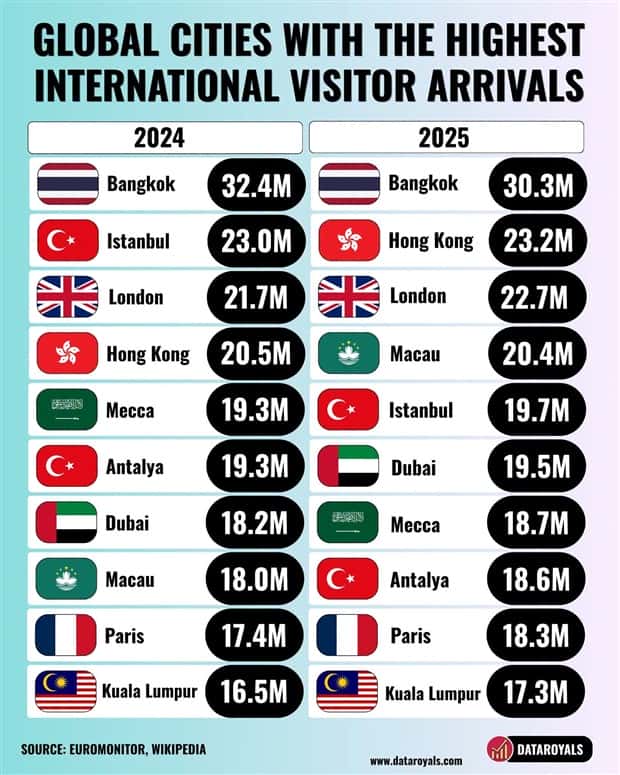
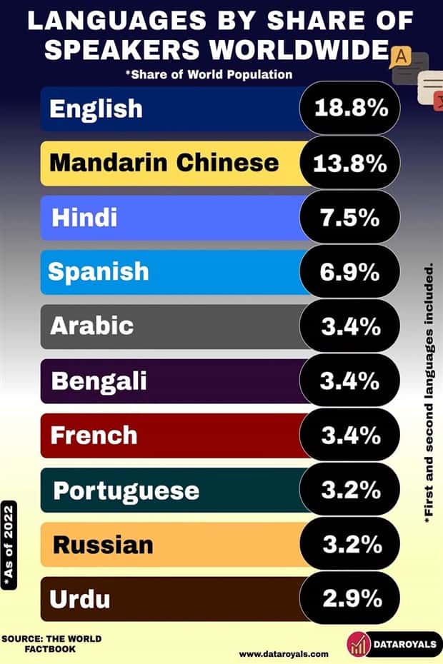
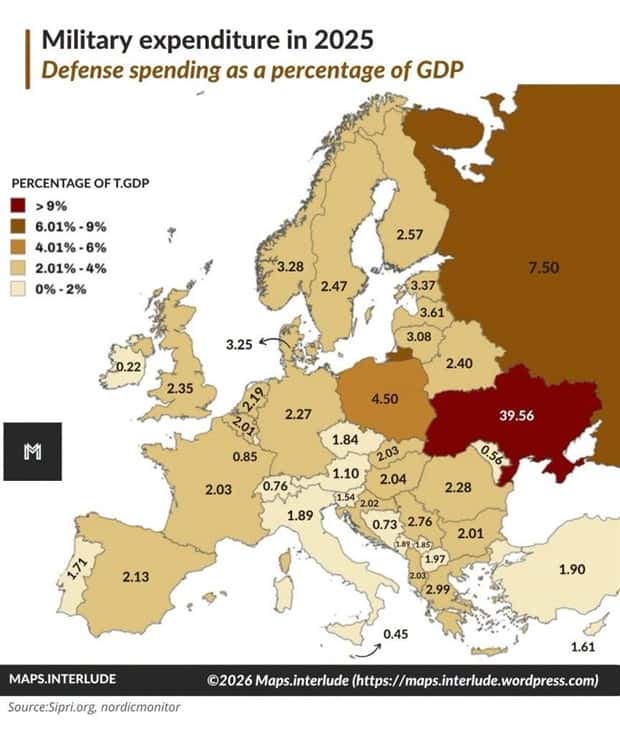

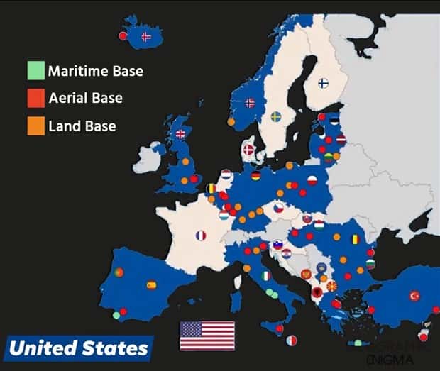

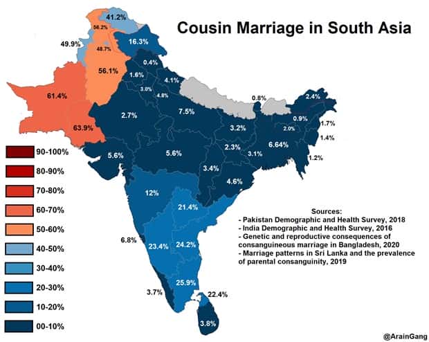
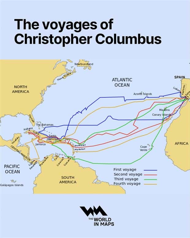
Take a look at more quirky charts and maps.



























Add comment