

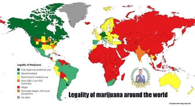
Not every interesting fact comes with a dramatic story. Sometimes, a strange ranking, an unexpected percentage, or a tiny detail on a map is enough to start a debate. Data can settle arguments, challenge popular beliefs, and occasionally prove that something everyone assumed was completely wrong.
The best part is seeing how differently people, places, and everyday things compare once the information is laid out clearly. A single graphic can explain more than a lengthy discussion, although some results will probably leave room for plenty of arguing.
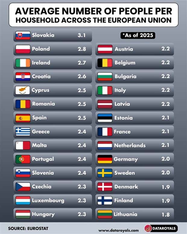
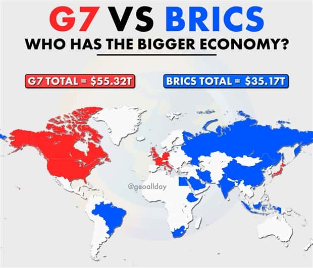
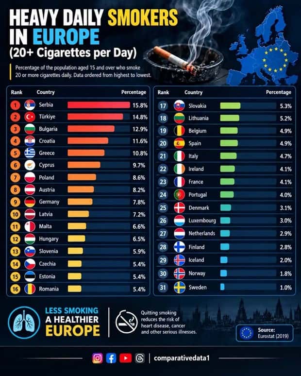
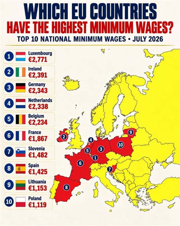
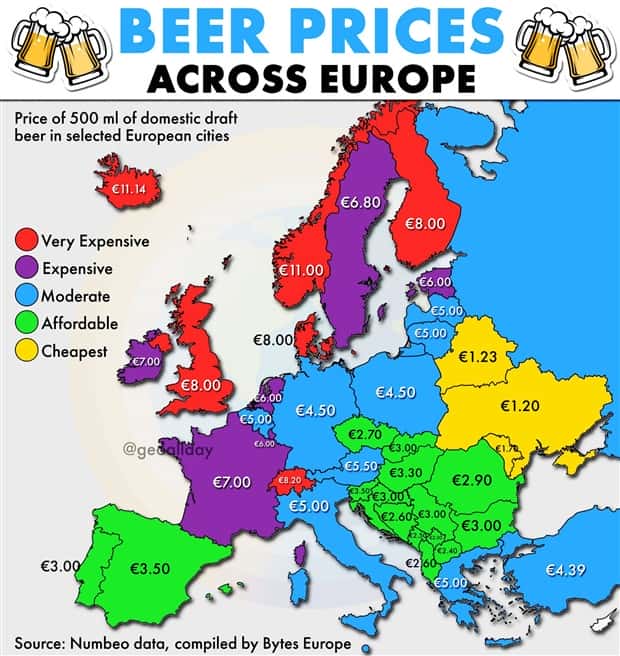
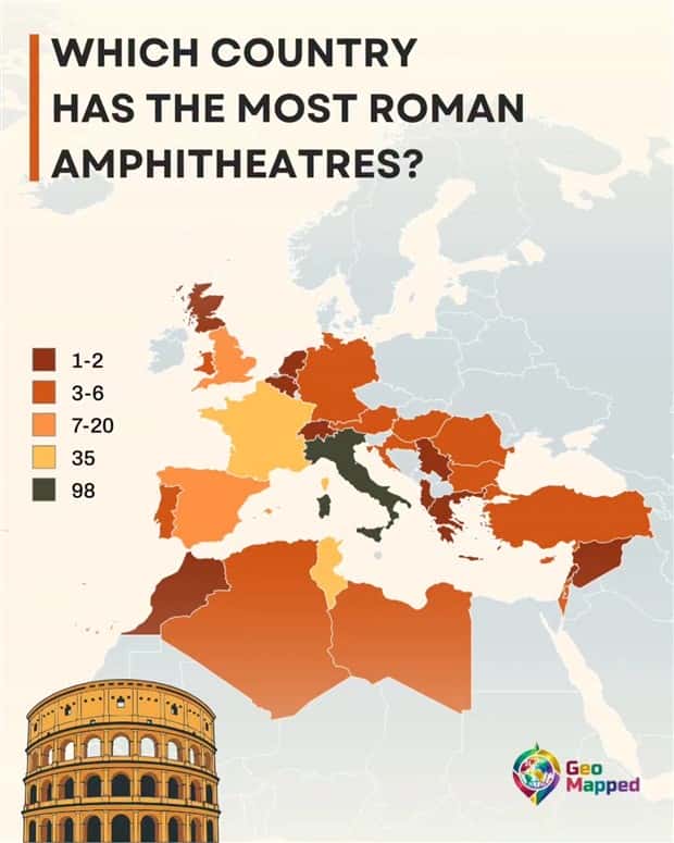
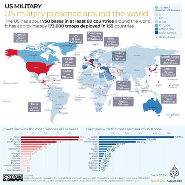
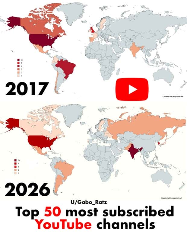
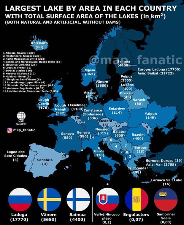
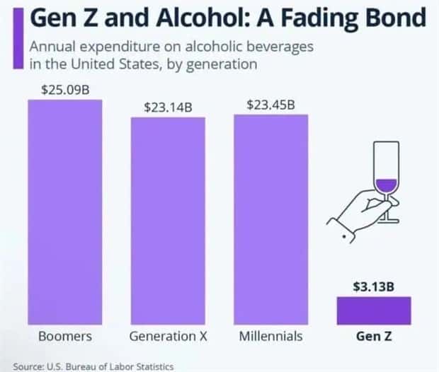
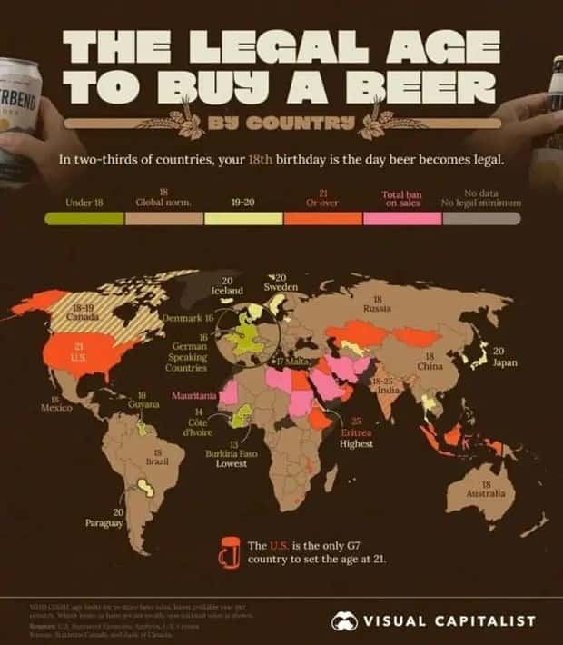
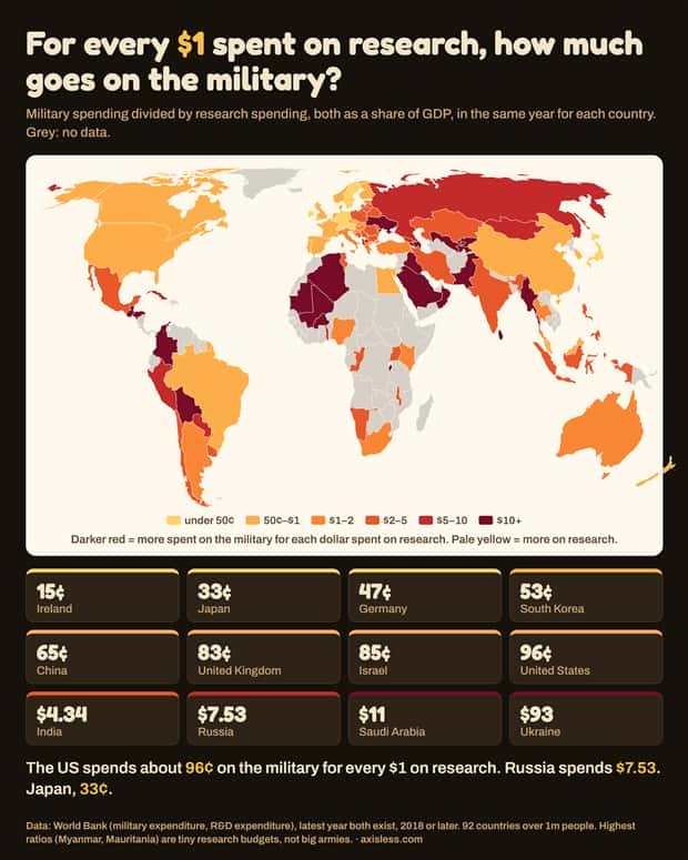
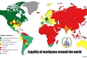
These charts and maps with intriguing data offer an entertaining mix of unusual findings, surprising rankings, and comparisons that put ordinary facts in a whole new perspective. 10/16/2026
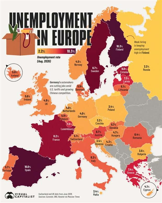
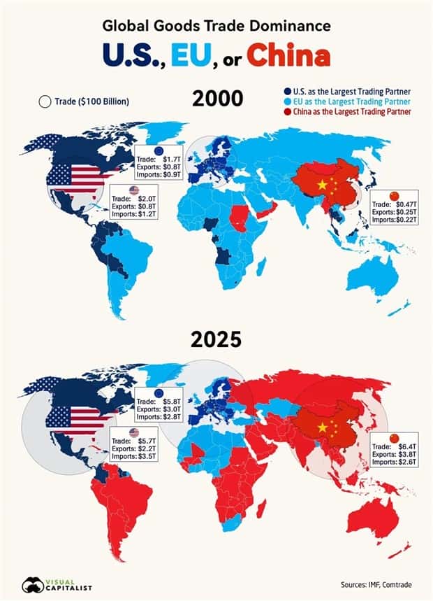
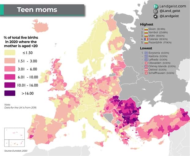





Take a look at more quirky charts and maps.



























Add comment