

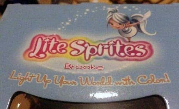
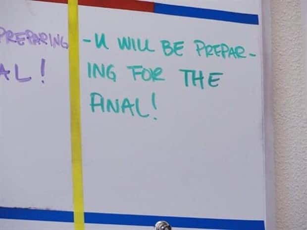
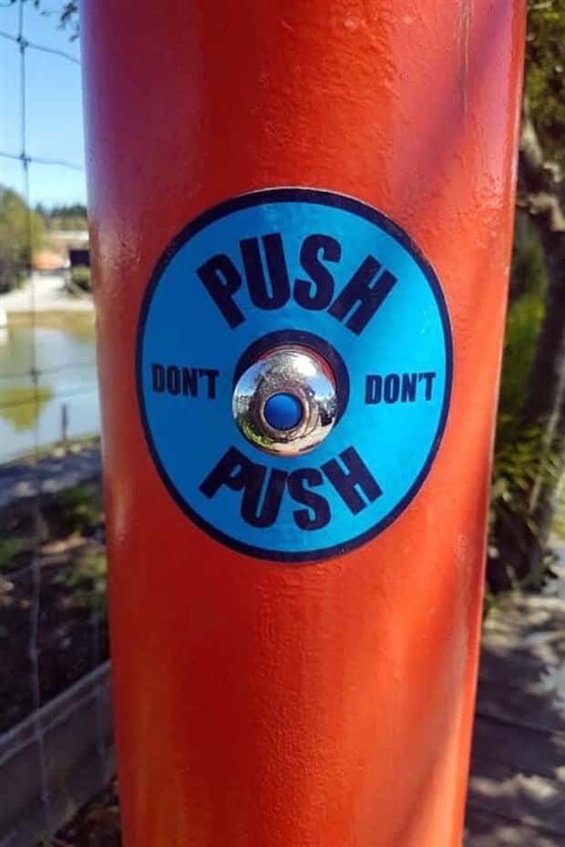
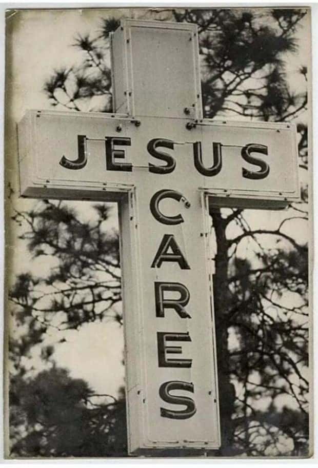
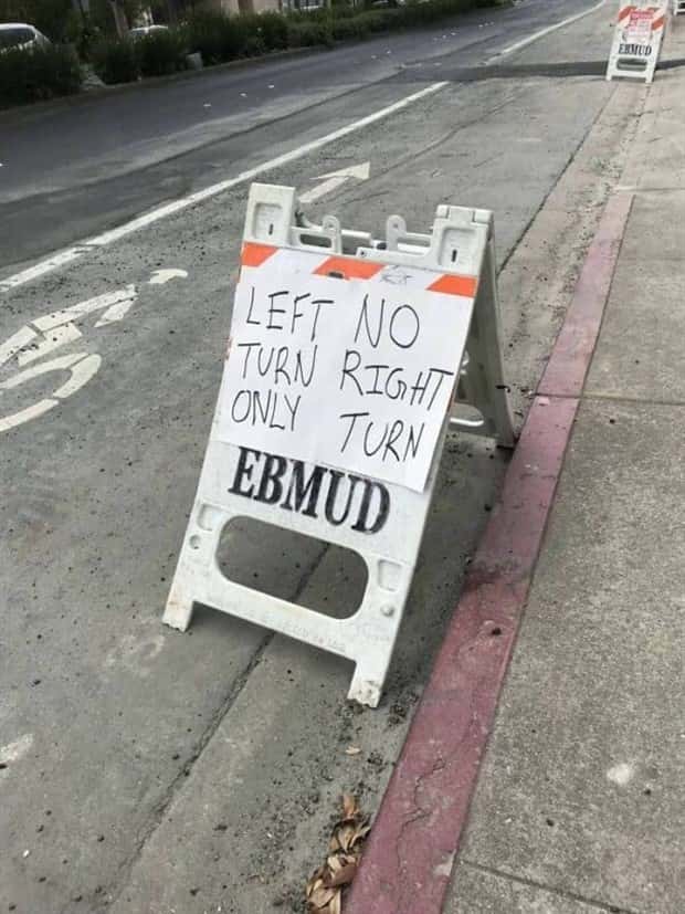
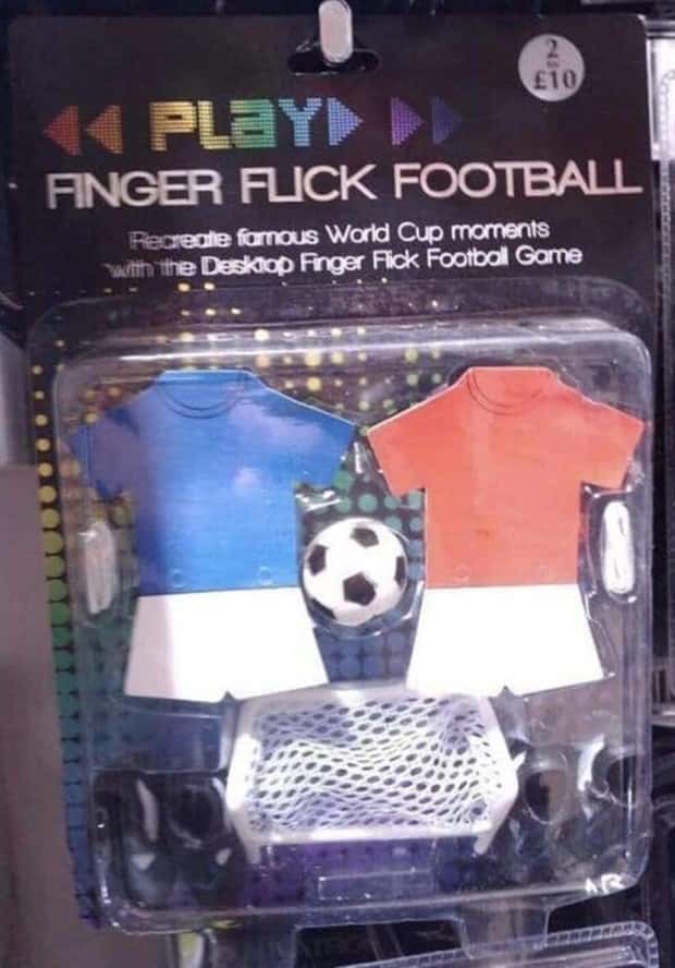
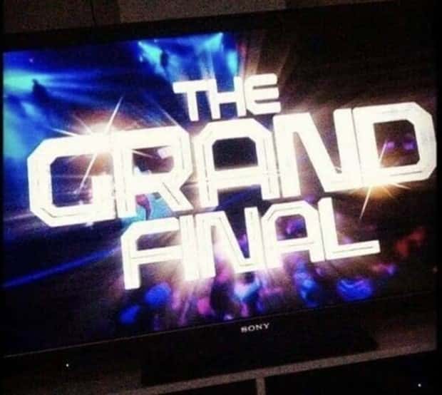
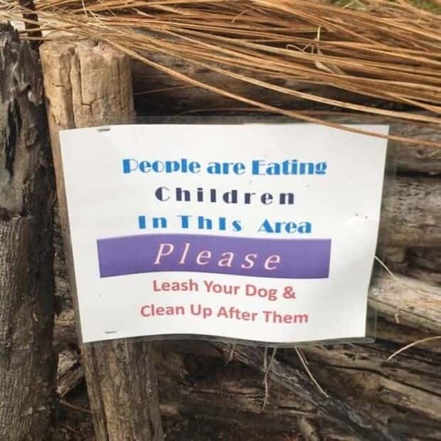
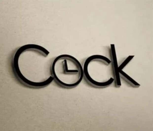
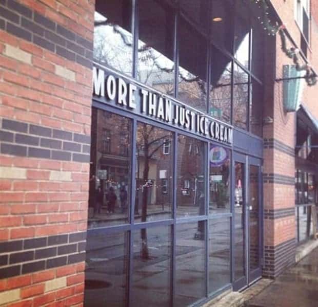
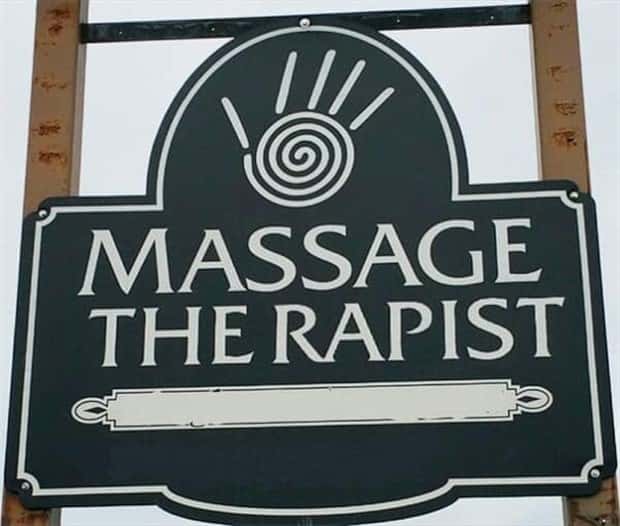
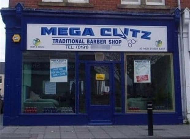
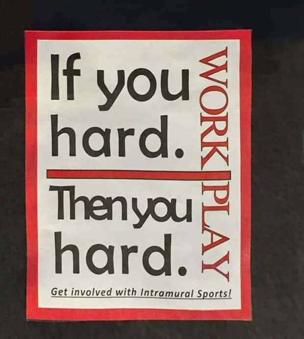
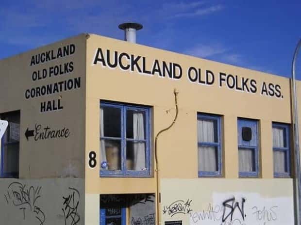
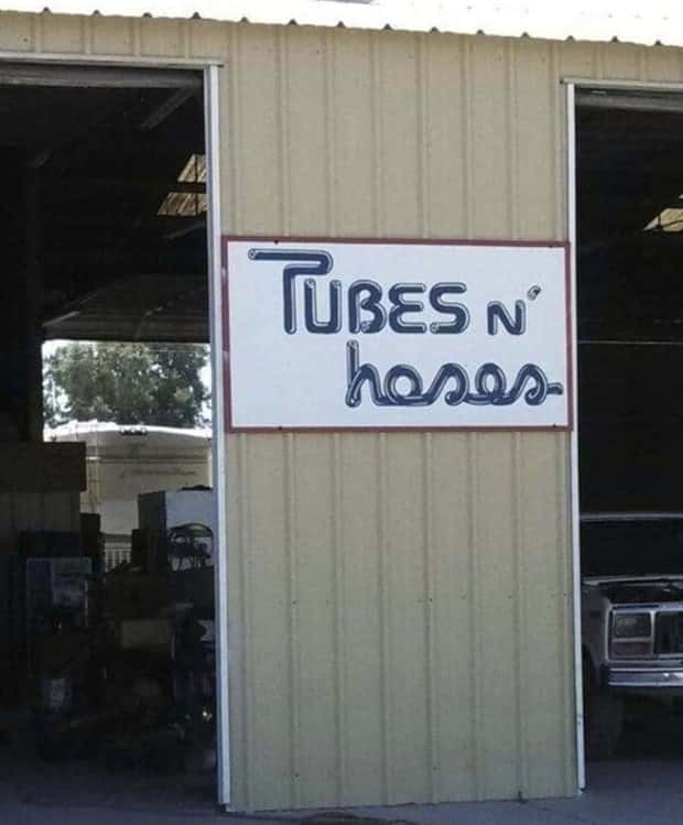
Bad kerning has a strange talent for making words hilarious without changing what they actually say. A tiny spacing mistake can turn clean typography into accidental comedy, leaving readers staring at letters as if they have just witnessed a minor design crime.
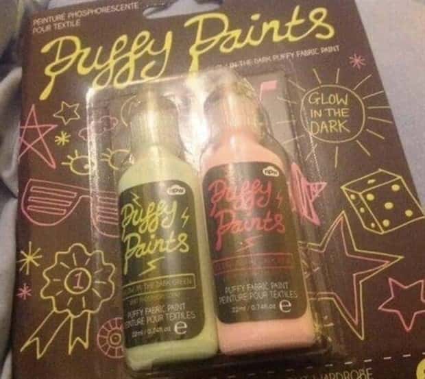
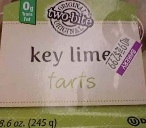
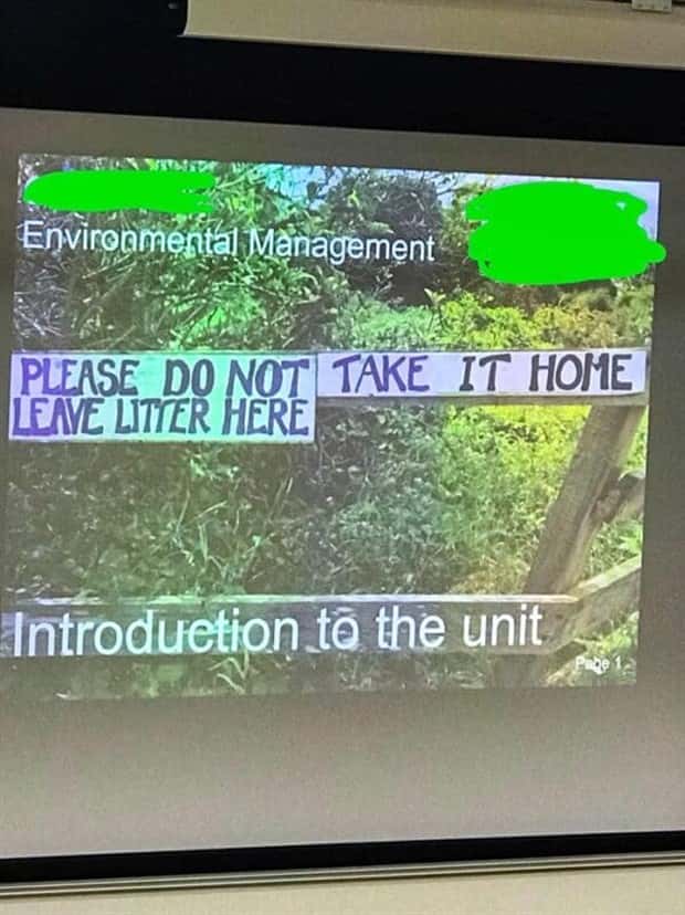
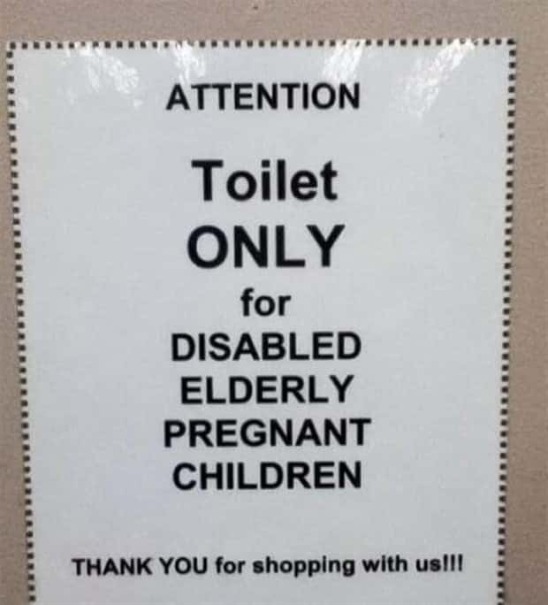
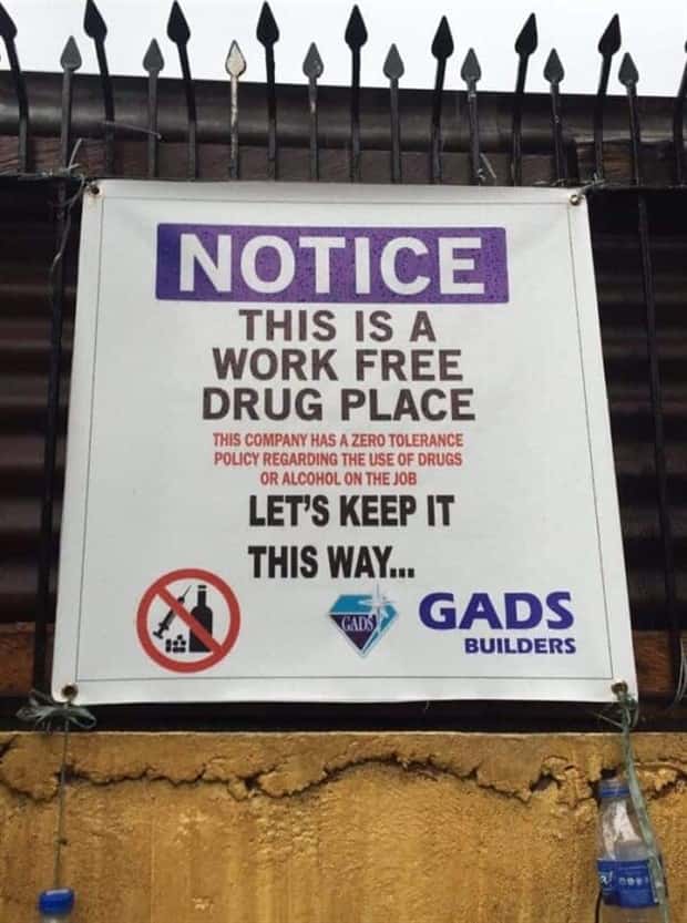
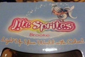
Poor kerning, awkward letter spacing, and sloppy typography can completely change the mood of a sign or headline. The funniest part is that the text often looks perfectly normal at first glance, then suddenly falls apart once the spacing starts behaving badly. Some layouts feel mildly confusing, while others look like the alphabet itself has given up.
Bad typography rarely needs a punchline. Give letters enough room to misbehave, and comedy practically types itself.



















Add comment