

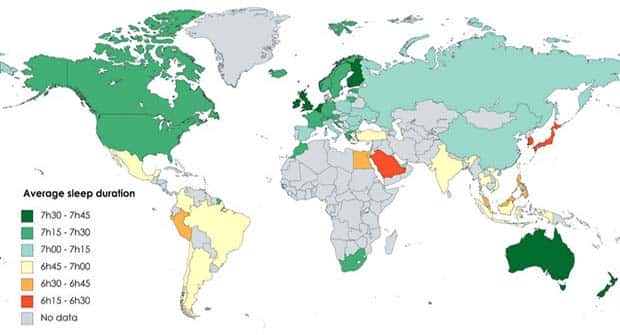
Some of the strangest things can be hiding inside ordinary statistics. A simple graph might expose an absurd trend, while an unexpected map can make a familiar subject look completely different. Add a few unusual comparisons and suddenly those boring-looking numbers become surprisingly entertaining.
There’s no need to crunch figures or stare at complicated formulas. These visuals are made for quick looks, random “wait, what?” moments, and the occasional second glance when something seems too strange to be true.
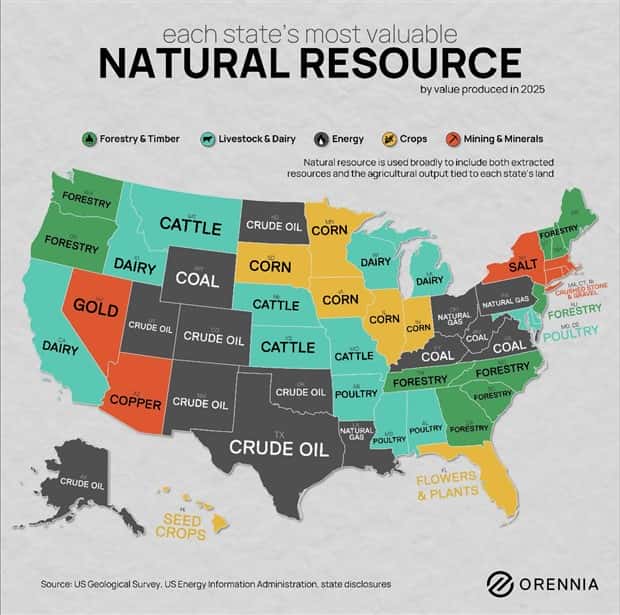
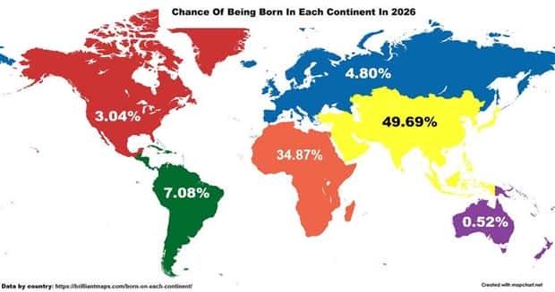
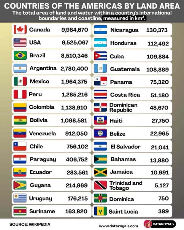
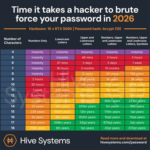
These charts and maps with intriguing data turn everyday statistics into unexpected, amusing visuals that are genuinely fun to explore. 8/14/2026
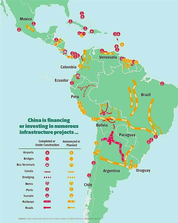
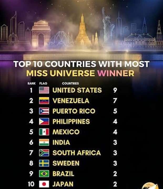
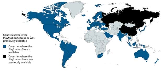


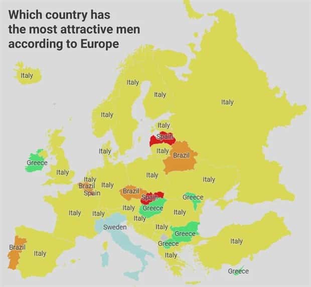
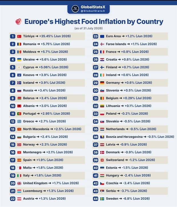
Take a look at more quirky charts and maps.



























Add comment