

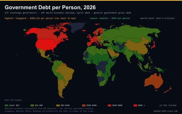
Statistics can tell some pretty strange stories. Once they are turned into colorful charts and detailed maps, unusual habits, regional differences, and unexpected facts become much easier to spot. A simple number suddenly has context, and that can make even boring-looking data surprisingly entertaining.
Some graphics explain complicated information in seconds, while others raise eyebrows with results that seem almost too strange to be true. There is always another odd comparison, curious pattern, or unexpected fact waiting in the next image.
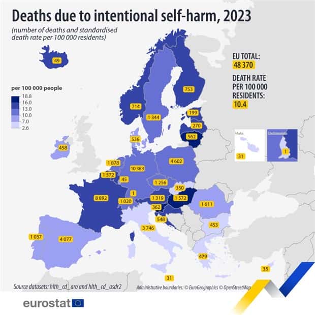
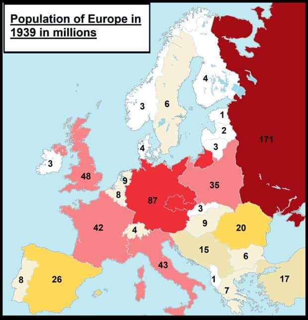
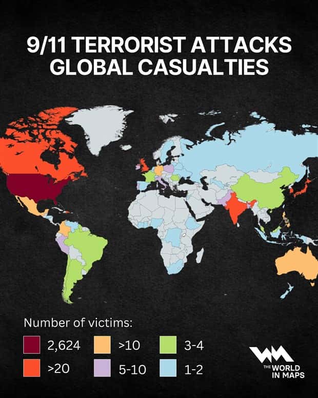
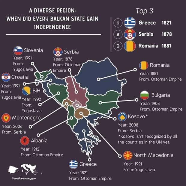
Take a closer look at these charts and maps with intriguing data for a collection of facts that mixes useful information with plenty of surprises. 9/18/2026
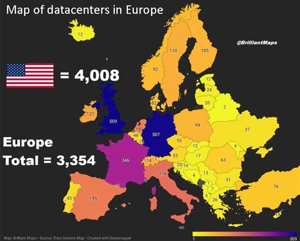
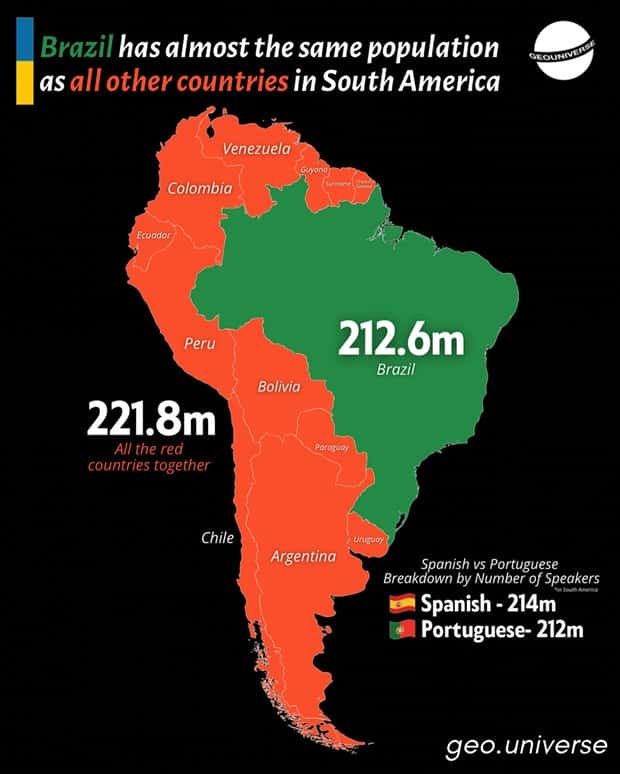
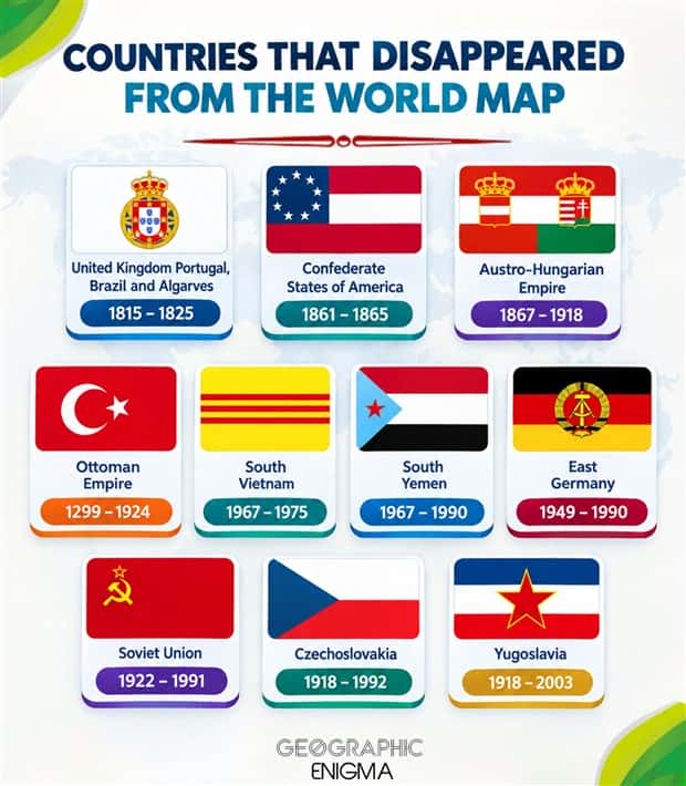
Take a look at more quirky charts and maps.



























Add comment