

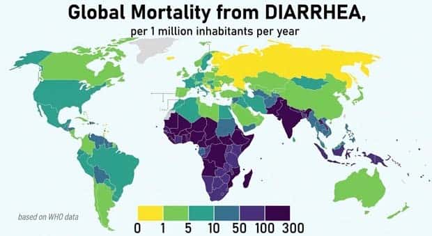
Ever looked at a statistic and thought, “Well, that’s oddly specific”? Visual data has a funny way of making random numbers feel far more interesting. A map can reveal a geographic quirk in seconds, while a well-made chart can turn a pile of figures into something surprisingly easy to understand.
The selections here cover all sorts of subjects, with comparisons that range from genuinely useful to wonderfully unexpected. Some facts are obvious once you see them. Others make you stop for a moment and wonder why nobody mentioned them before.
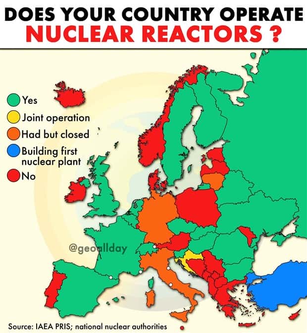
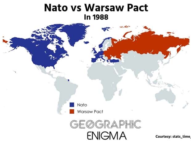
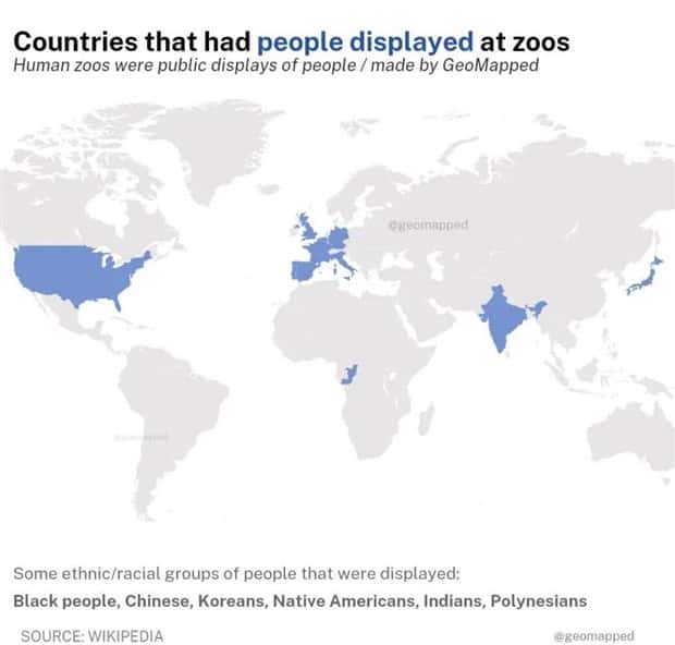
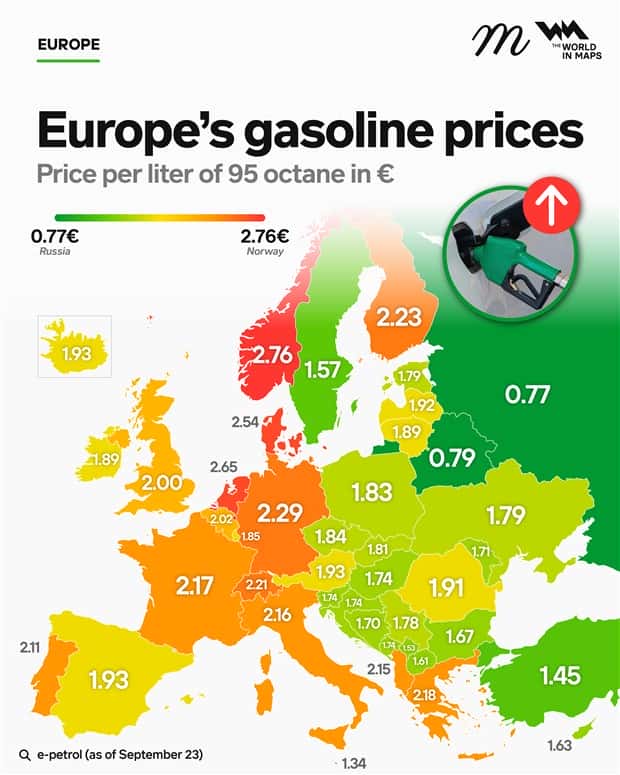
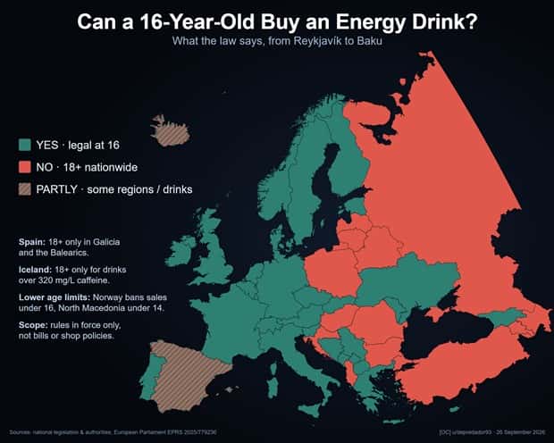
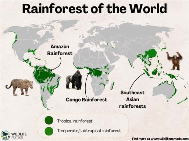
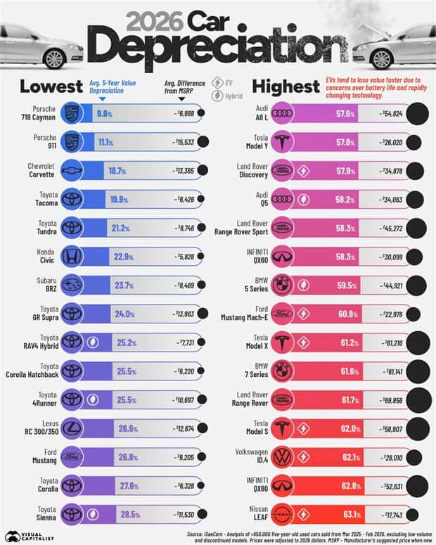
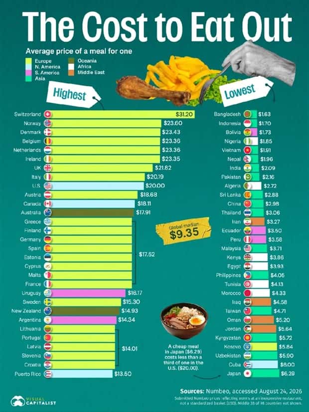
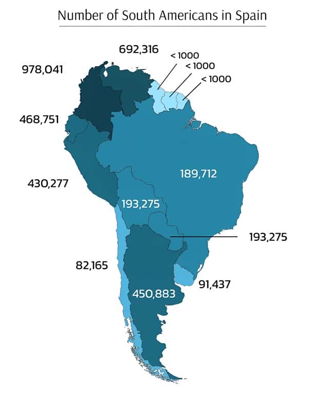
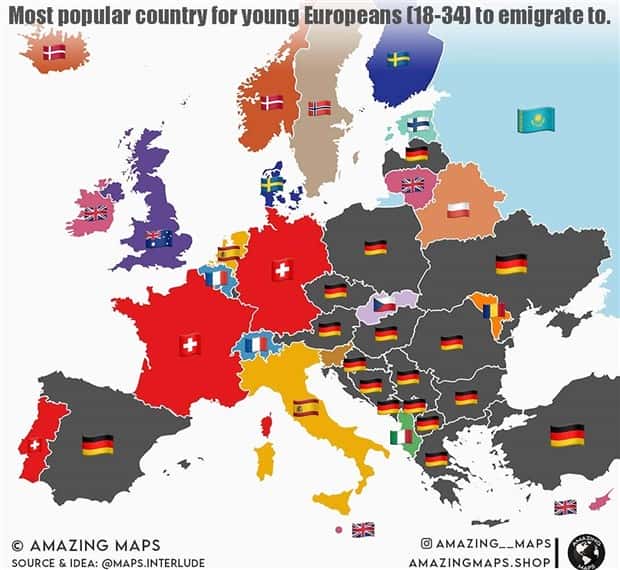
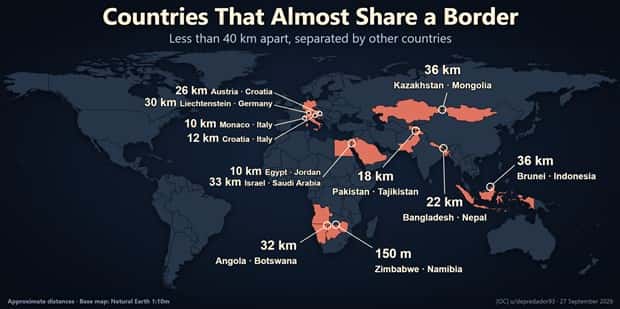
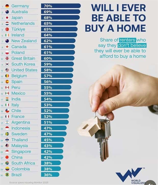
Scroll through these 20 charts and maps with intriguing data for unusual comparisons, surprising statistics, and plenty of facts that might stick in your head. 10/2/2026
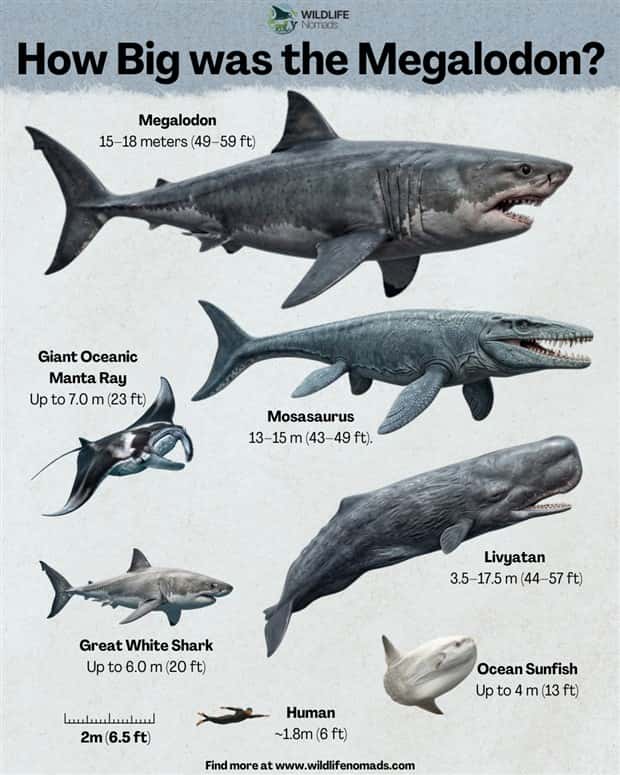
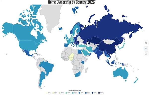
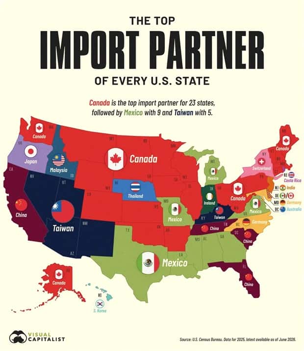
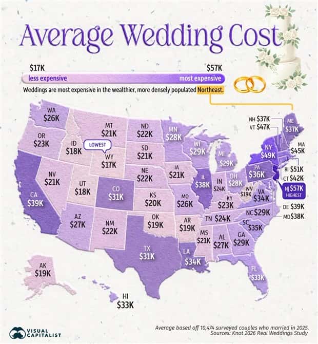
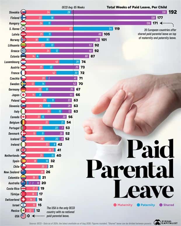
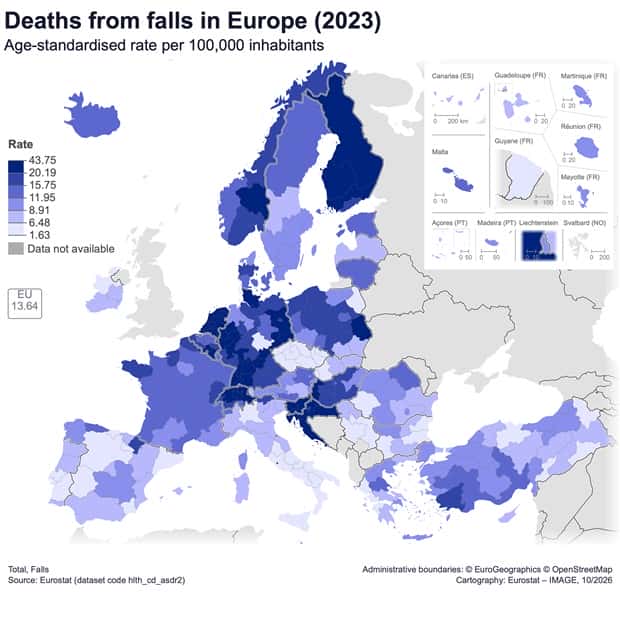
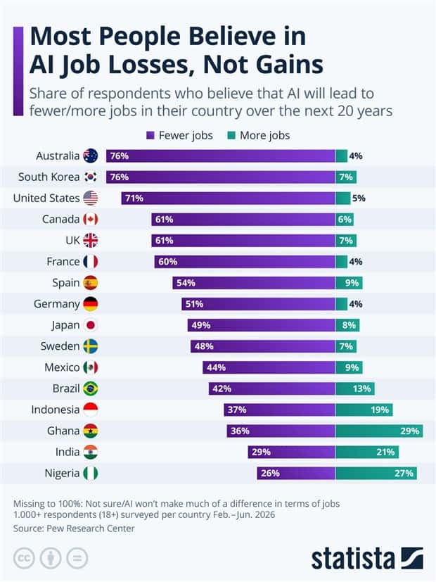
Take a look at more quirky charts and maps.



























Add comment