


Charts and maps can make ordinary information surprisingly entertaining. Strange statistics, unexpected comparisons, and unusual patterns become much easier to spot when numbers are turned into eye-catching visuals. What looks like a basic fact at first can suddenly become funny, confusing, or genuinely fascinating.
The best part is that each graphic offers something different. Some reveal curious connections, others highlight bizarre trends, and a few may leave you wondering how the numbers even make sense.
These 18 charts and maps with intriguing data turn everyday statistics into fun, surprising visuals that are easy to enjoy and hard to scroll past. 8/21/2026
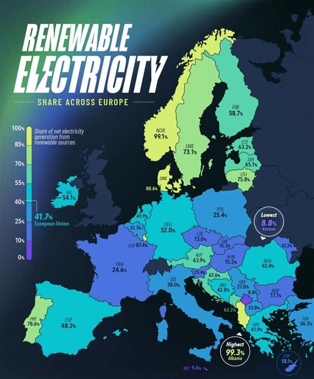
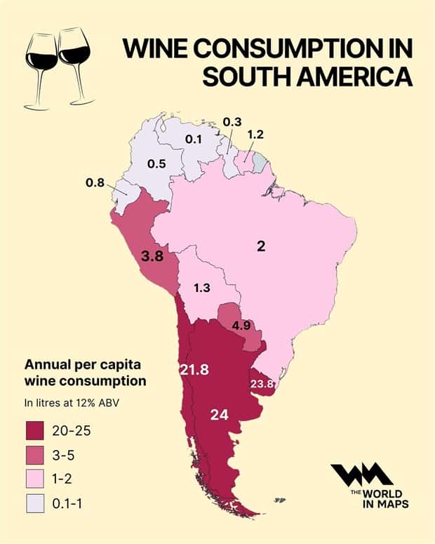
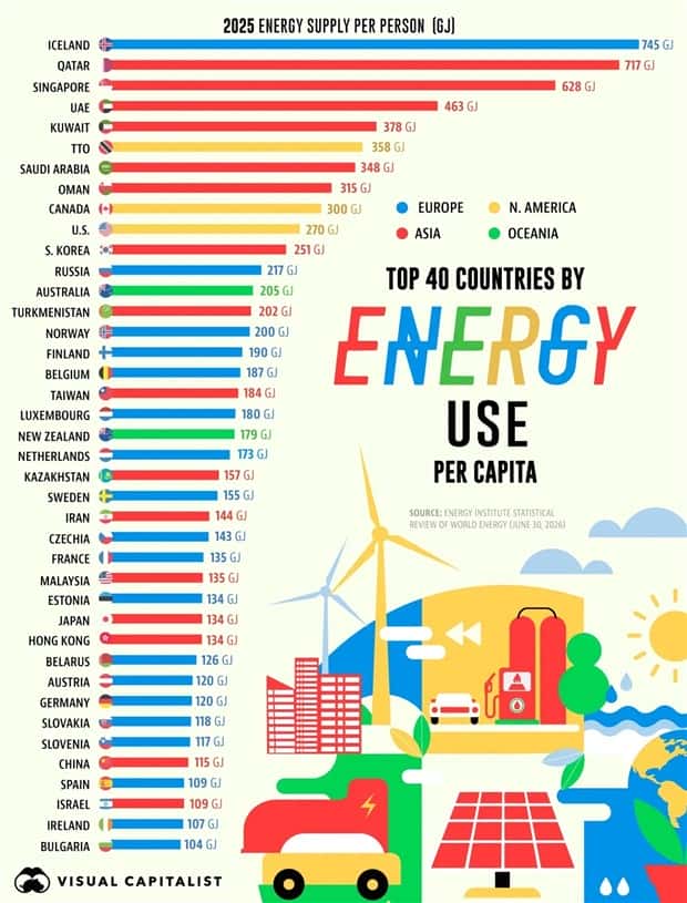
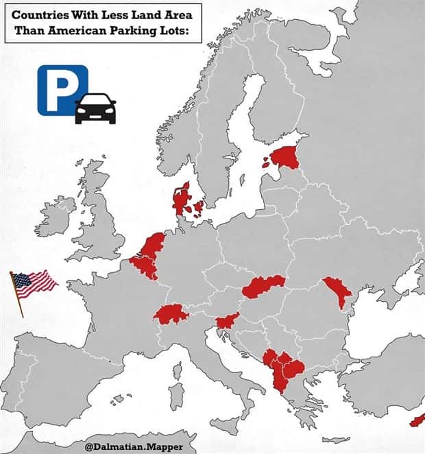
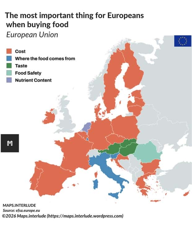
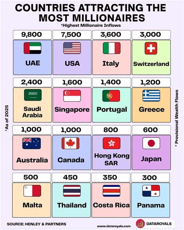
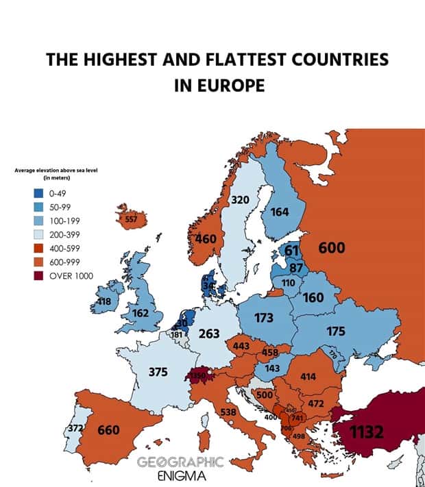
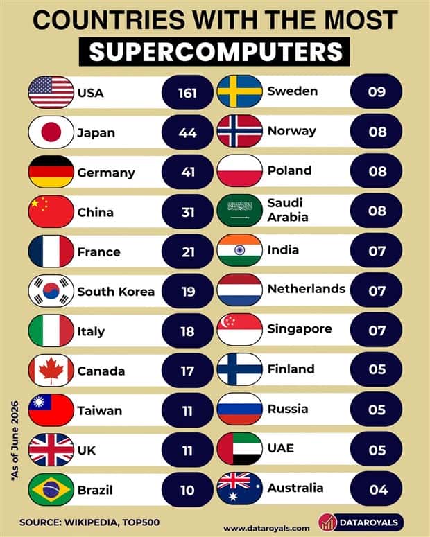
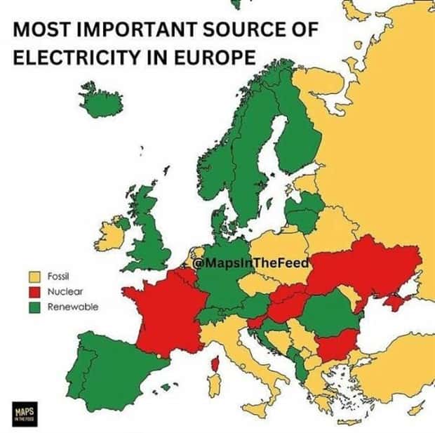
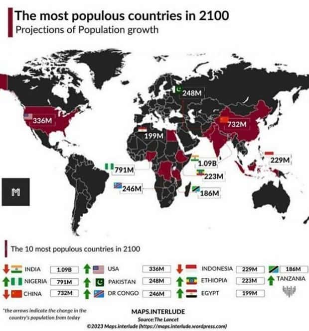
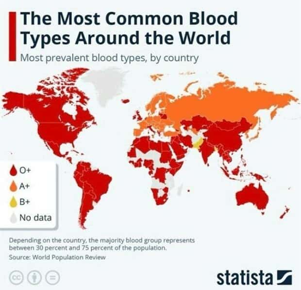

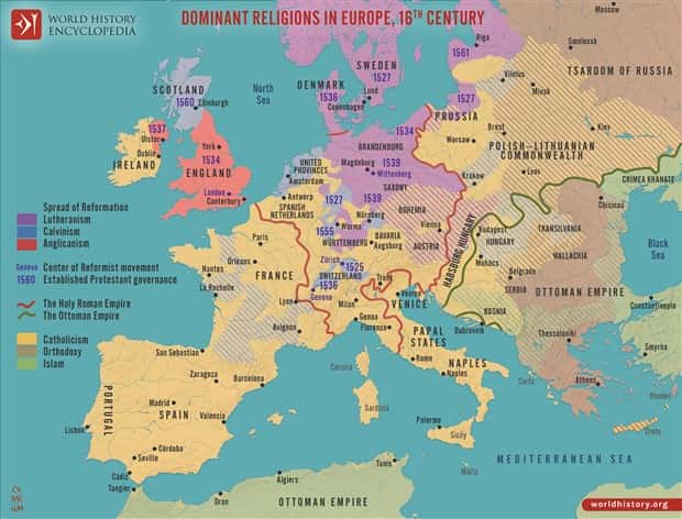
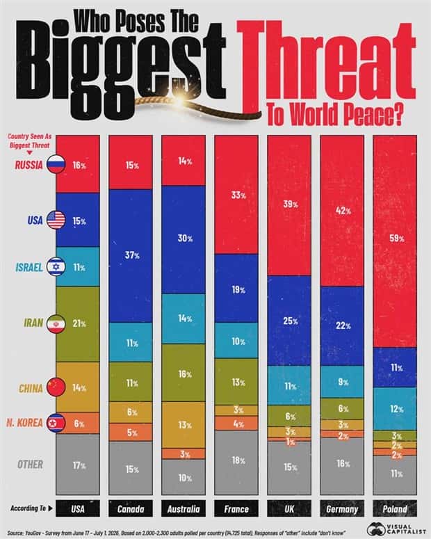

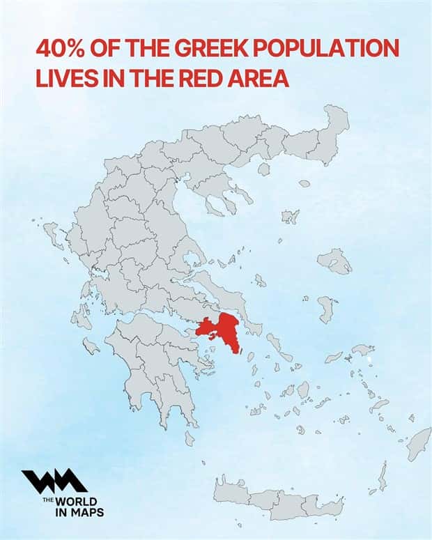
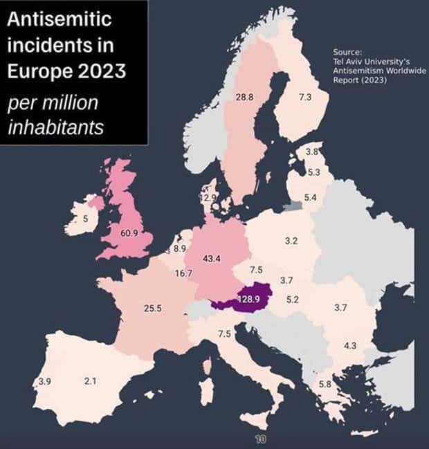
Take a look at more quirky charts and maps.



























Add comment